Ansarada design system ACE – Part 1
Increase engagement and improve efficiency in design and development
Problem
A lot of feedback has been received from front and backend developers and designers who currently use ACE, outlining that the documentation is not clear, difficult to understand and hard to find components. This is impacting their level of engagement with ACE.
Our vision is to build a world class design system that enables teams to implement and contribute to our design language easily. To increase engagement and improve efficiency in design and development, we need to make sure that components are easy to find and the right information is documented in a clear way.
We also want to share the success of our design system with the wider design community to improve our brand awareness and attract even more great designers.
Goals
- Improve contributions to ACE by 25%
- Address negative feedback on the ease of use of ACE documentation
- Unify design across Ansarada platform
Assumptions
They will primarily be using ACE from a desktop or laptop.
Planning
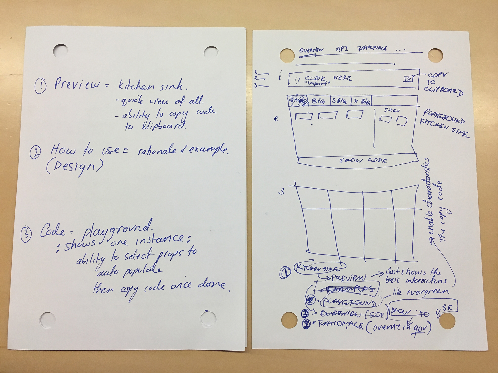
The DesignOps team all sat together to have a quick planning session and also sketch out some initial ideas. We wanted to get them all down on paper so we could ‘park’ them and not let them dictate any solution before speaking to our users.
User workshop / sessions
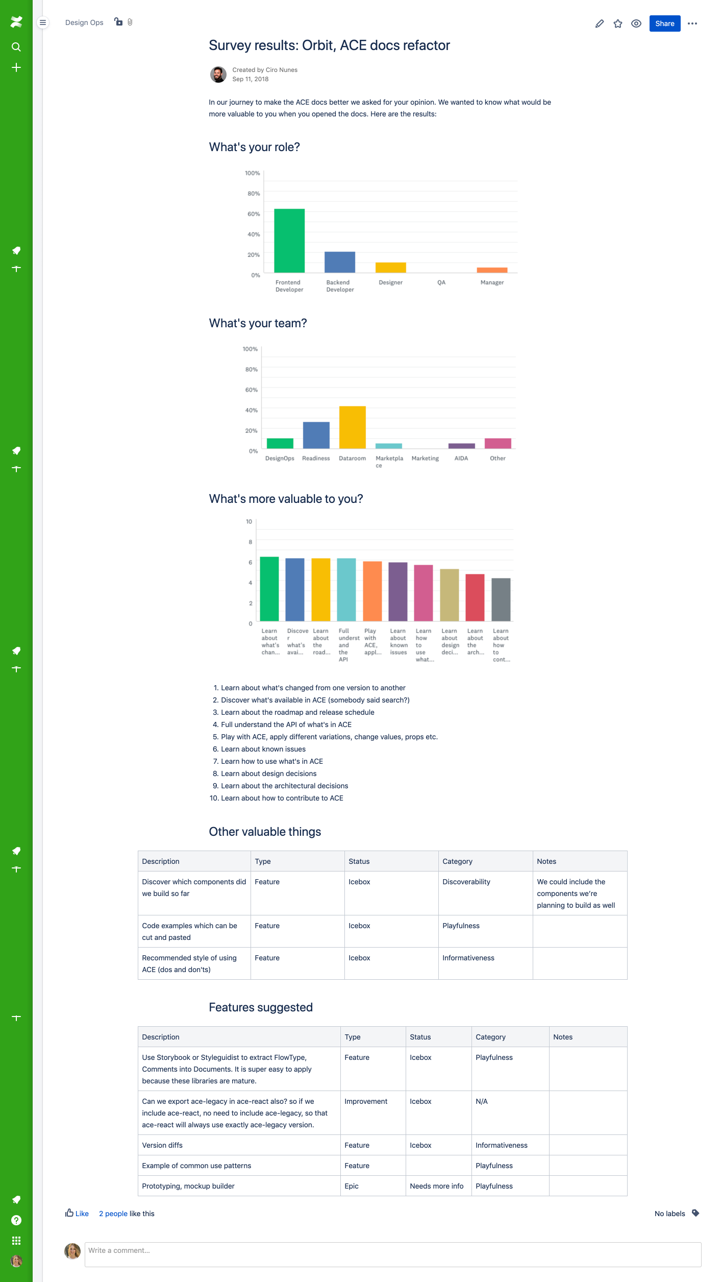
In anticipation to me coming on board at Ansarada, the team ran workshops where they ideated and dot-voted on ideas, sent out surveys to gauge who within the company uses ACE, what their role is and what they find valuable. They also held a ‘de-brief’ meeting where they summarised all their findings ready to handover to me when I started!
All their findings were incredibly valuable and allowed us to hit the ground running.

Findings
We found that the major blockers to people engaging with ACE were:
-
The process of creating and documenting components was completely manual, time consuming and error prone
-
It was hard to understand the correct way to use components – e.g in which situation should you use a link vs a button that looks like a link
Our focus was on solving these 2 strong blockers.
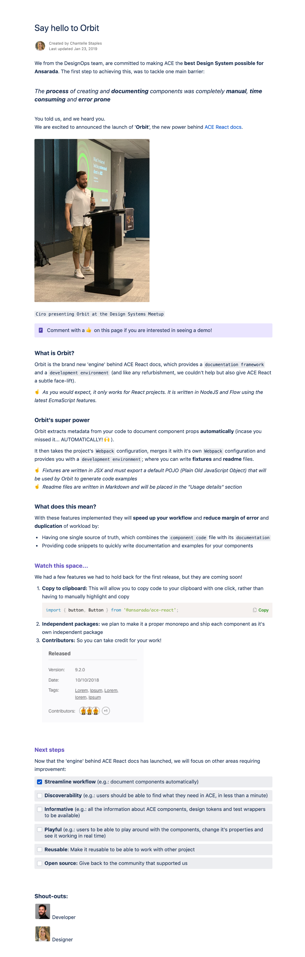
This was where ‘Orbit’ was born!
What is Orbit?
Orbit is the brand new ‘engine’ behind ACE React docs, which provides a documentation framework for automating the generation of component documentation straight from the code and a development environment.
In addition to Orbit, we wanted to work hard at improving all existing documentation of our components to help both developers and designers know which component to use, where and when.
(and like any refurbishment, we couldn’t help but also give ACE React a subtle face-lift).
Comparative research
We set out to learn from those who do it best and conducted competitive research looking at other Design systems and evaluated them based on:
- Ease of navigation
- Search-ability
- Find-ability of components
- Quality of supporting documentation (was it easy to understand from both a developer and designer point of view)
Prototypes
Low-fidelity
I quickly mapped out a few ideas based on the comparative research findings and our user goals, thought through some initial interactions before deciding which to move into higher fidelity for testing.
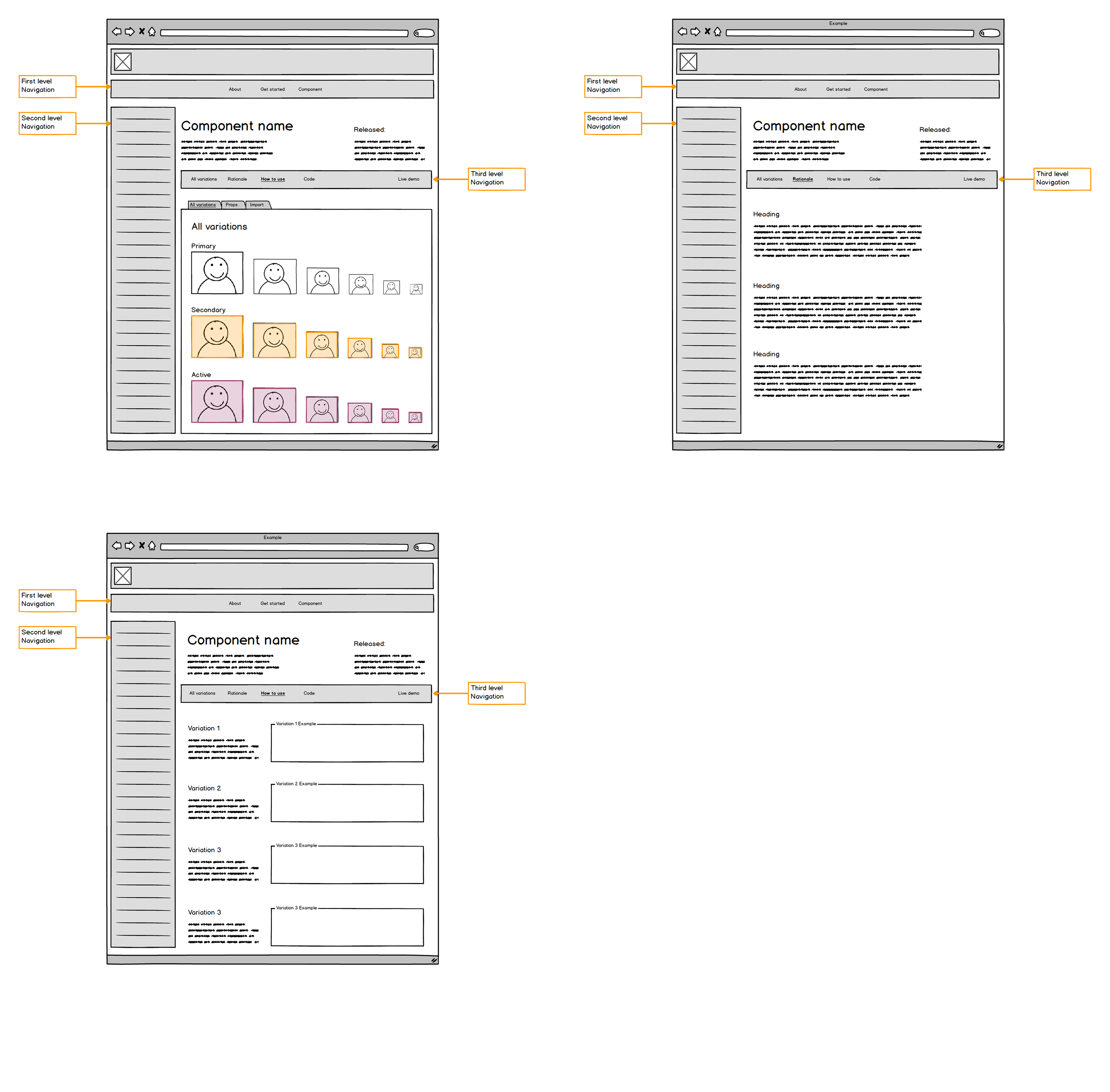
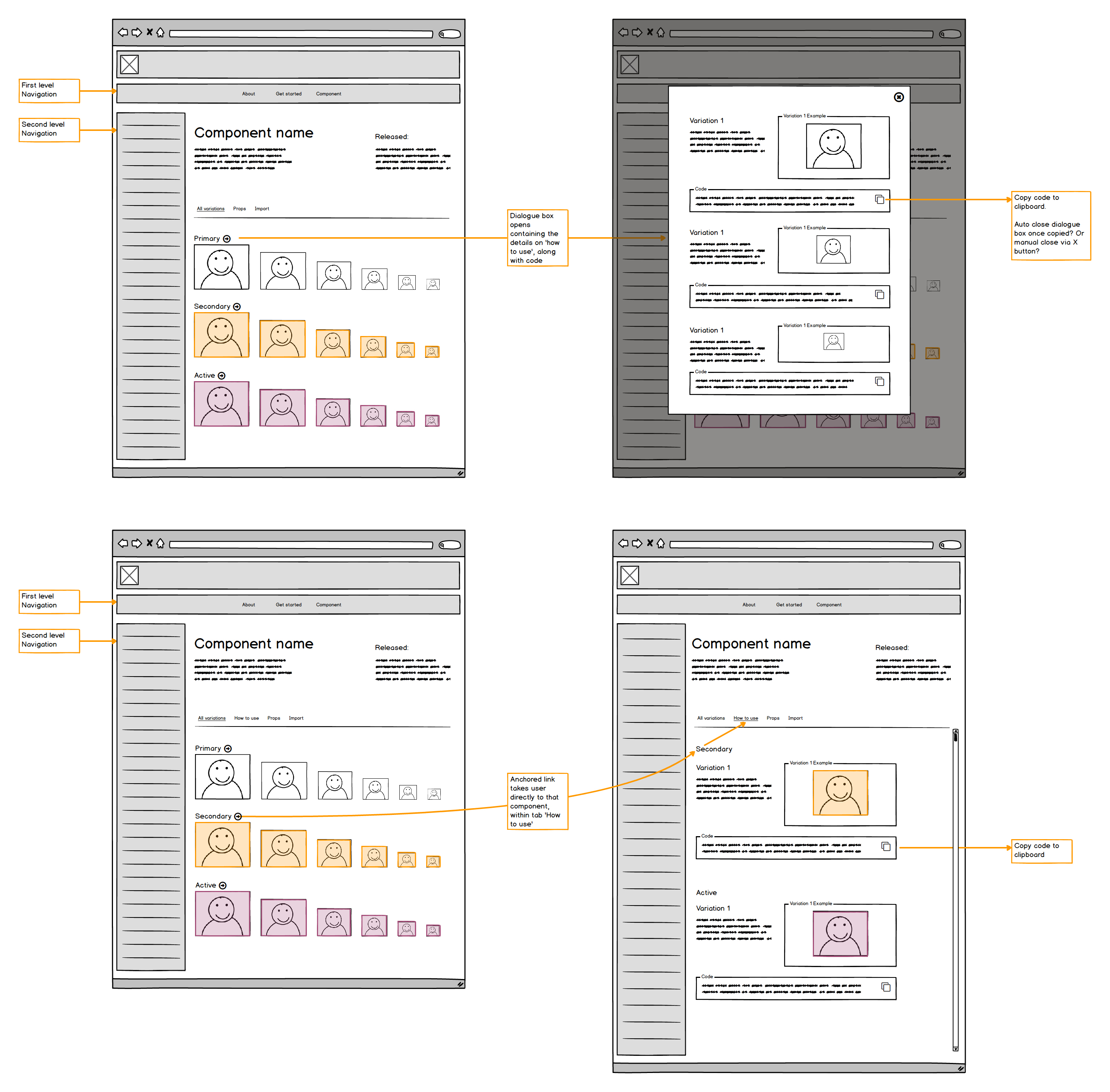
Hi-fidelity
Using screenshots of the current ACE docs and it’s components I rapidly created some hi-fidelity interactive prototypes in InVIsion to test with our users.
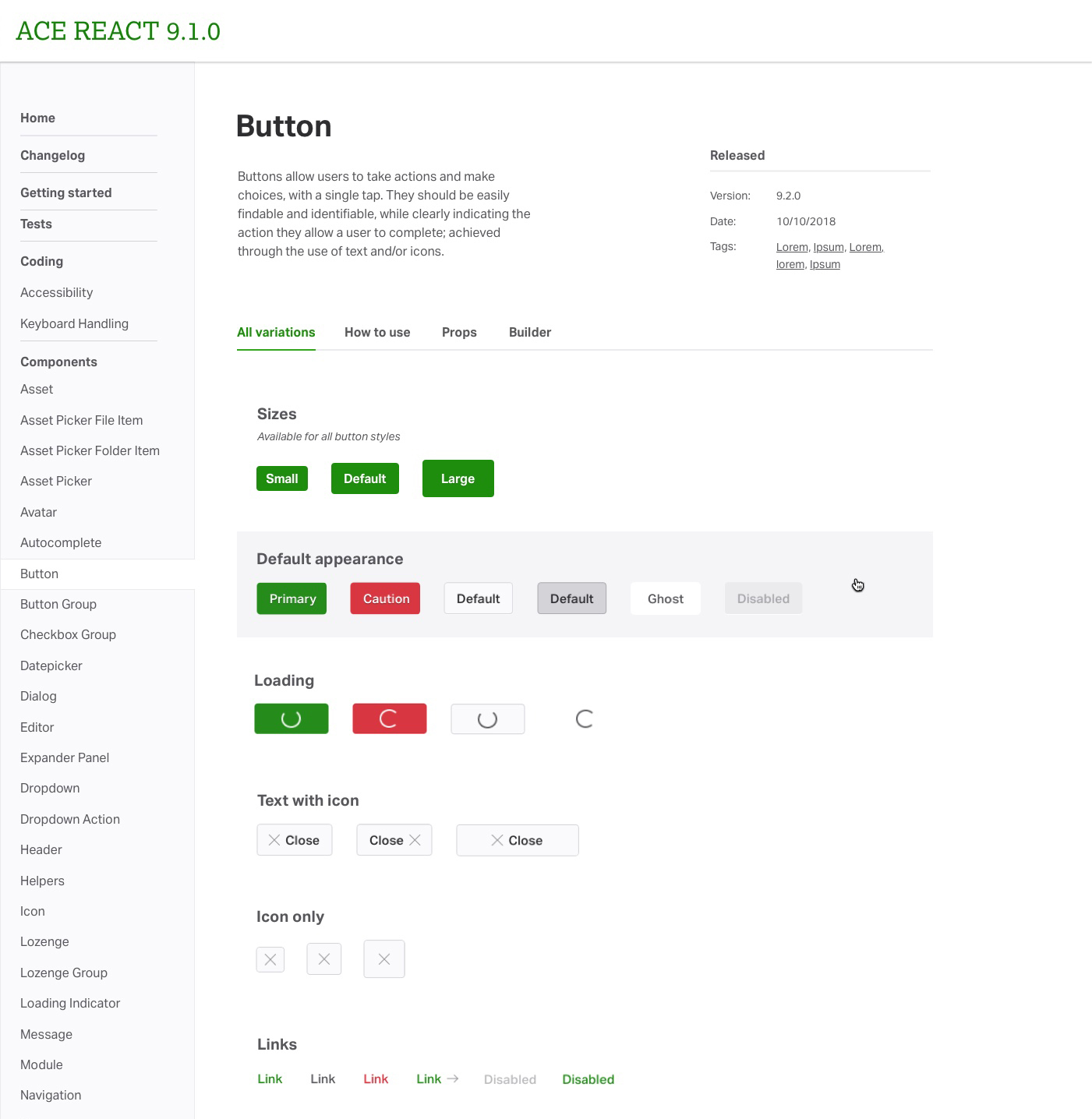
We outlined a task for them to complete and asked them to think out loud and express any pros-cons / blockers / likes / dislikes, while they were going through the task.
At the end we asked a number of other questions to asses where improvements needed to be made.
The task and findings were all documented in Confluence where we also added some ideas / references for the next iteration.
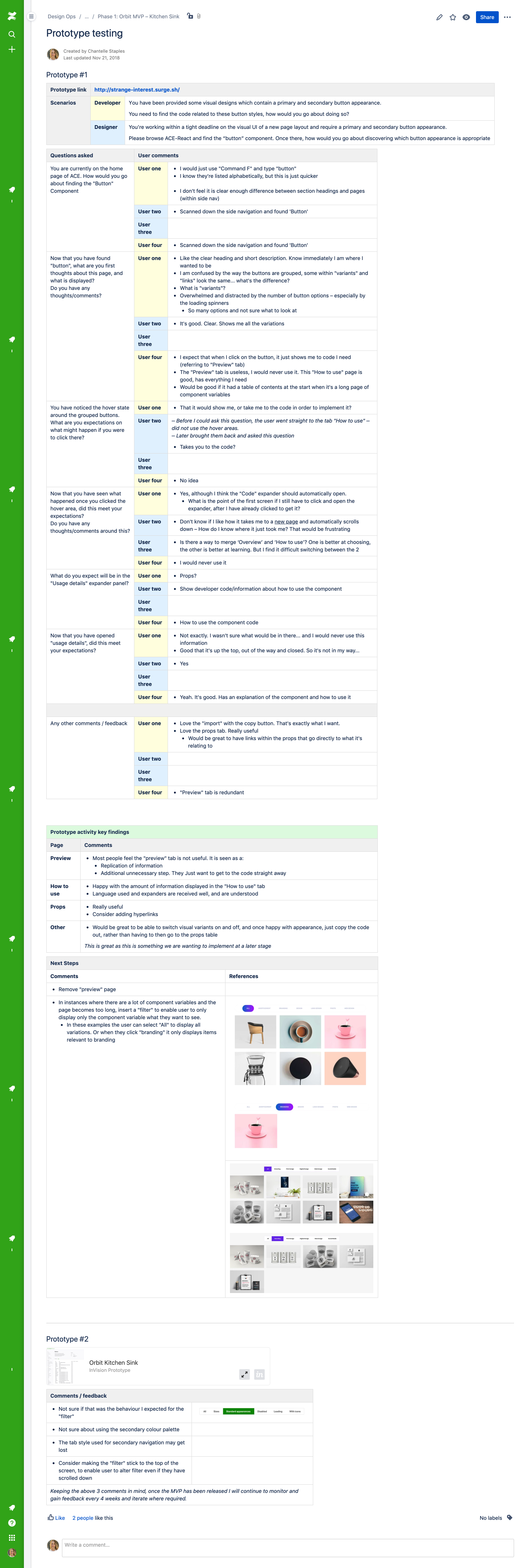
Next steps
Based on the insights gained from user testing, we decided which areas we would make further enhancements prior to release, and also assessed and prioritised a backlog for future iterations.
Orbit MVP launched
We announced the launch of Orbit via a blog post and highlighted all the improvements we made, as well as what was coming next.
Next steps
Add documentation of our design tokens and patterns.