Domain Onboarding emails
Improve customer engagement during on boarding
With the brief in mind, we got together to write down some key words, and research examples of tone of voice which encapsulates:
- What our users feel when they interested in property (buying or renting)
- Why our users prefer to use Domain products
- How we want them to feel etc

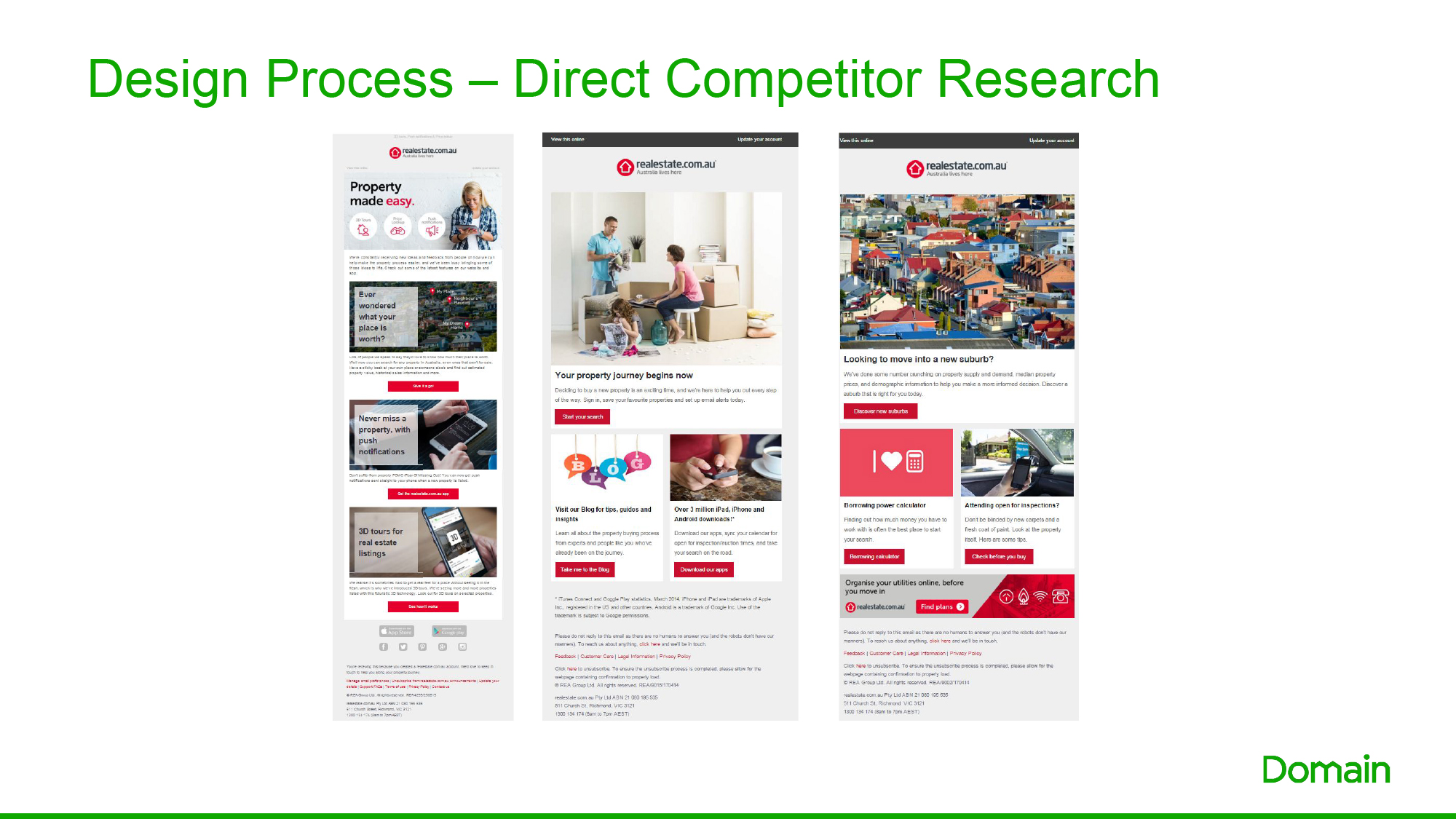
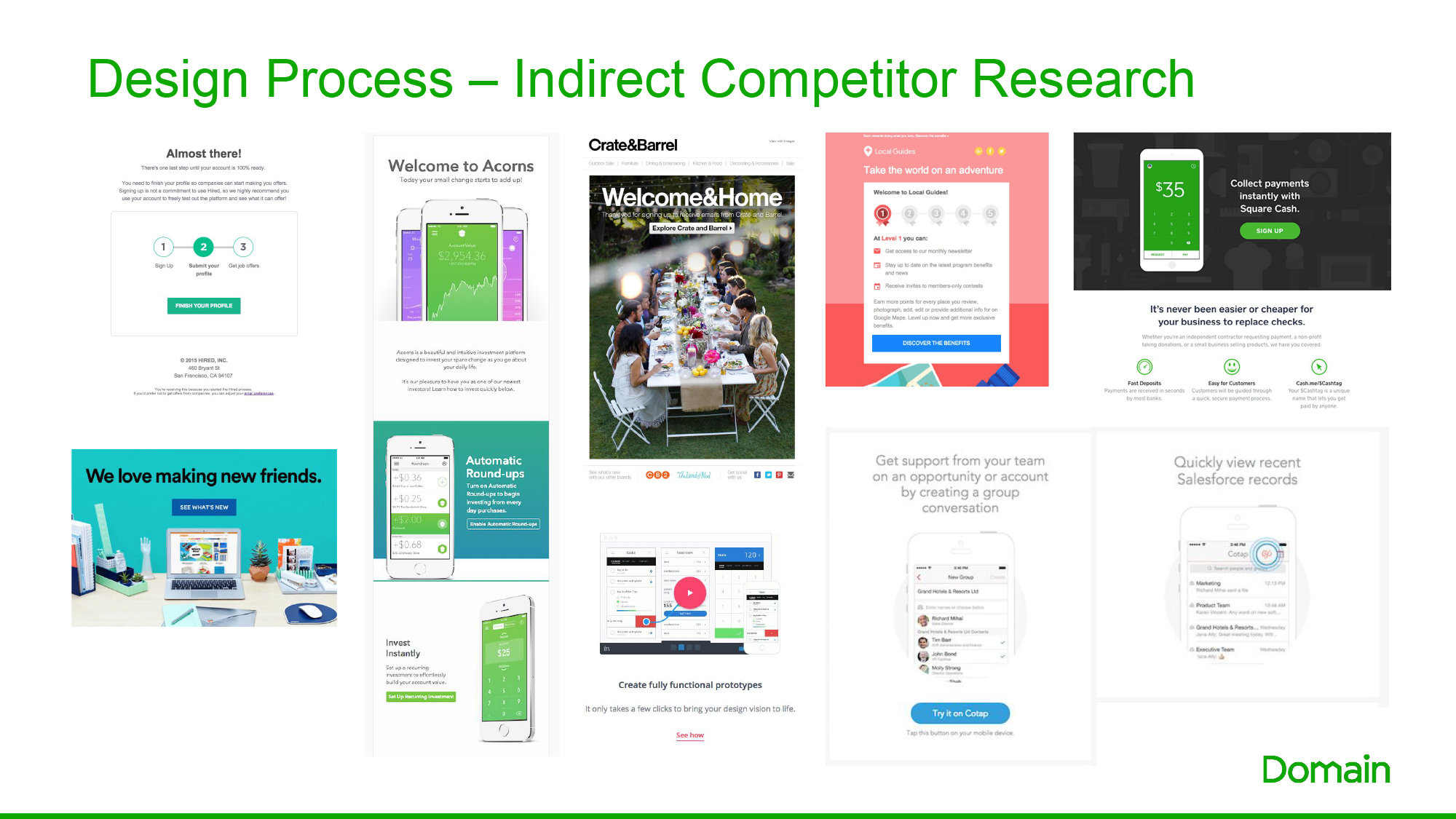
We took a look at what our direct (such as REA) and indirect competitors (companies doing the same thing, but necessarily the same product) were doing within their onboarding emails.
– We felt that REA’s onboarding journey was not very strong as the first email a user gets, was loaded with facts and different CTA which would make it overwhelming and confusing for the user. All subsequent emails just looked like a generic article/news newsletter so weren’t really adding any value for a new customer
Some design elements we felt made other companies communications strong were things like:
- The counter/stage markers which demonstrates visually what stage they are in the onboarding process
- Simple clean message
- Relaxed, friendly tone of voice
- Use of engaging device imagery
- Iconography
- Demonstrational illustrations
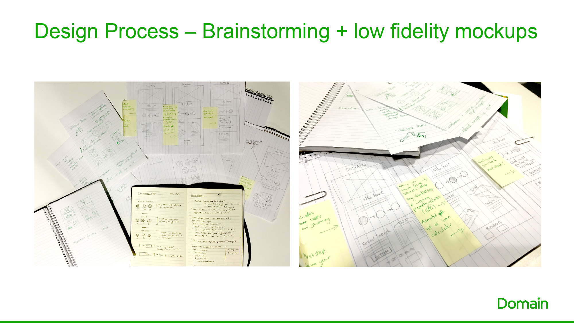
The next stage is conduct some rapid brainstorming and throw all our ideas down on paper!
At this early stage we need to make sure that we are thinking:
- Mobile first
- How the design will need vary or reposition responsively from desktop to mobile – for example will 3 icons next to each other on desktop stack or just scale on mobile?
- How to best represent our key words
- Introducing tone of voice
- And the biggest one, what design limitations will experience as a lot of email clients when coding
We then look at them all as a whole and decide which ideas are the strongest, and should be taken to the next step – high fidelity designs.
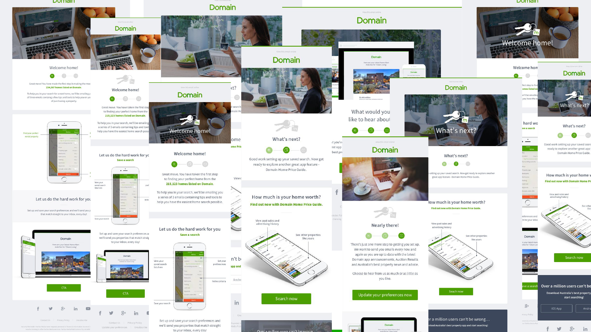
With our keywords in mind, we decided that using the heading “Welcome Home” in the first email would not only be friendly and relaxed, but it is also inspirational – making the user feel like they’re one step closer to finding their dream home.
We felt that the best icon to represent this would be a key, as a key is:
- Obtained when you purchase or rent a home
- Gives the feeling of security, ownership and feeling safe
- The opacity of the key started quite light but through further development, we thought it should have more prominence – to convey “being sure, and proud of something”
We wanted to incorporate the a design piece which showed the stage the user was at within the onboarding process.
Our first idea was to include lock and key icons within the circles – this is to indicate which stage you have “unlocked” and which are left to go.
Although we felt that this was a clear translation, we didn’t feel that it was really adding any value.
From there, we decided to incorporate icons which were not only relevant to the emails content, but would also provide product recognition as these icons are also used within the app and on the website.
To the right are some early applications of the iconography, tone of voice and some different mobile device options.
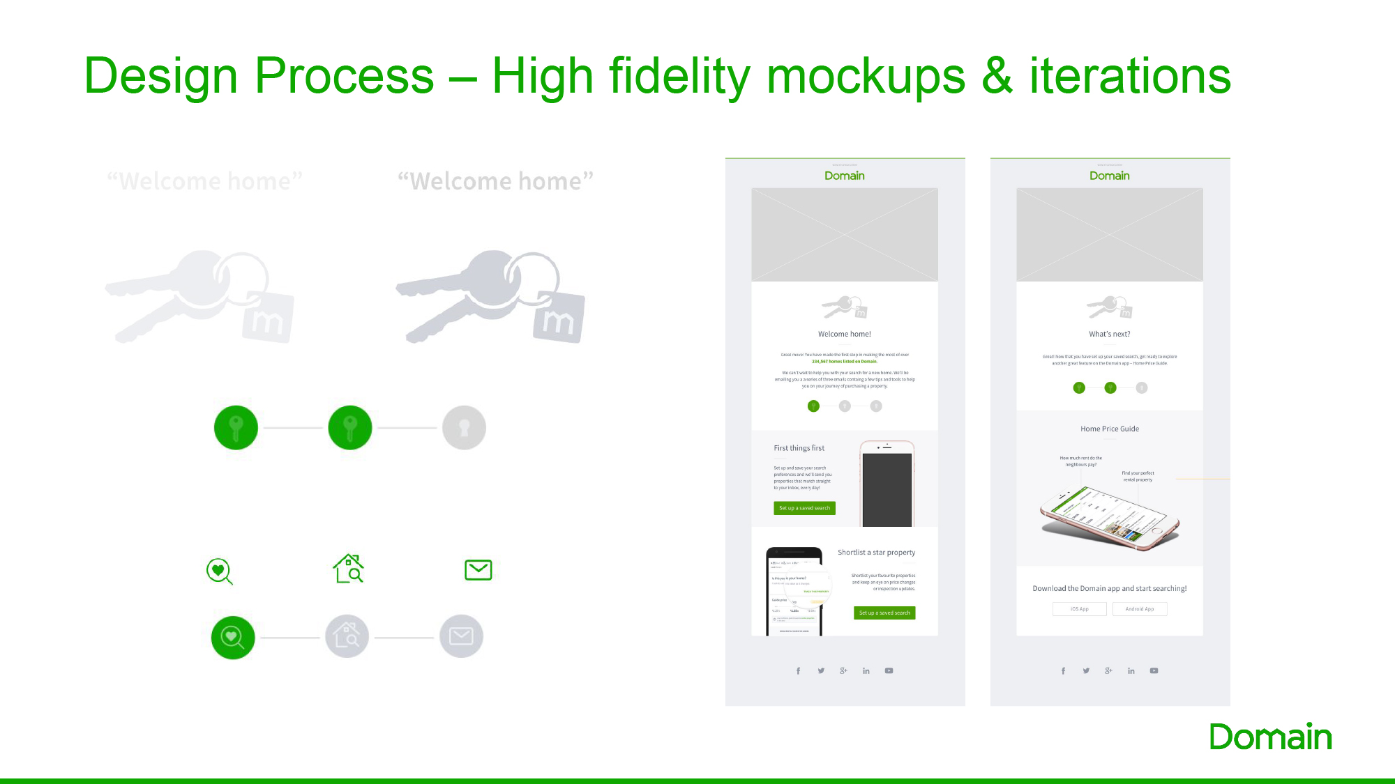
To prevents the emails from becoming too long and boring with instructions on how to use the product, we thought this would be represnted through an animated gif.
This gives the user content, while also keeping them engaged
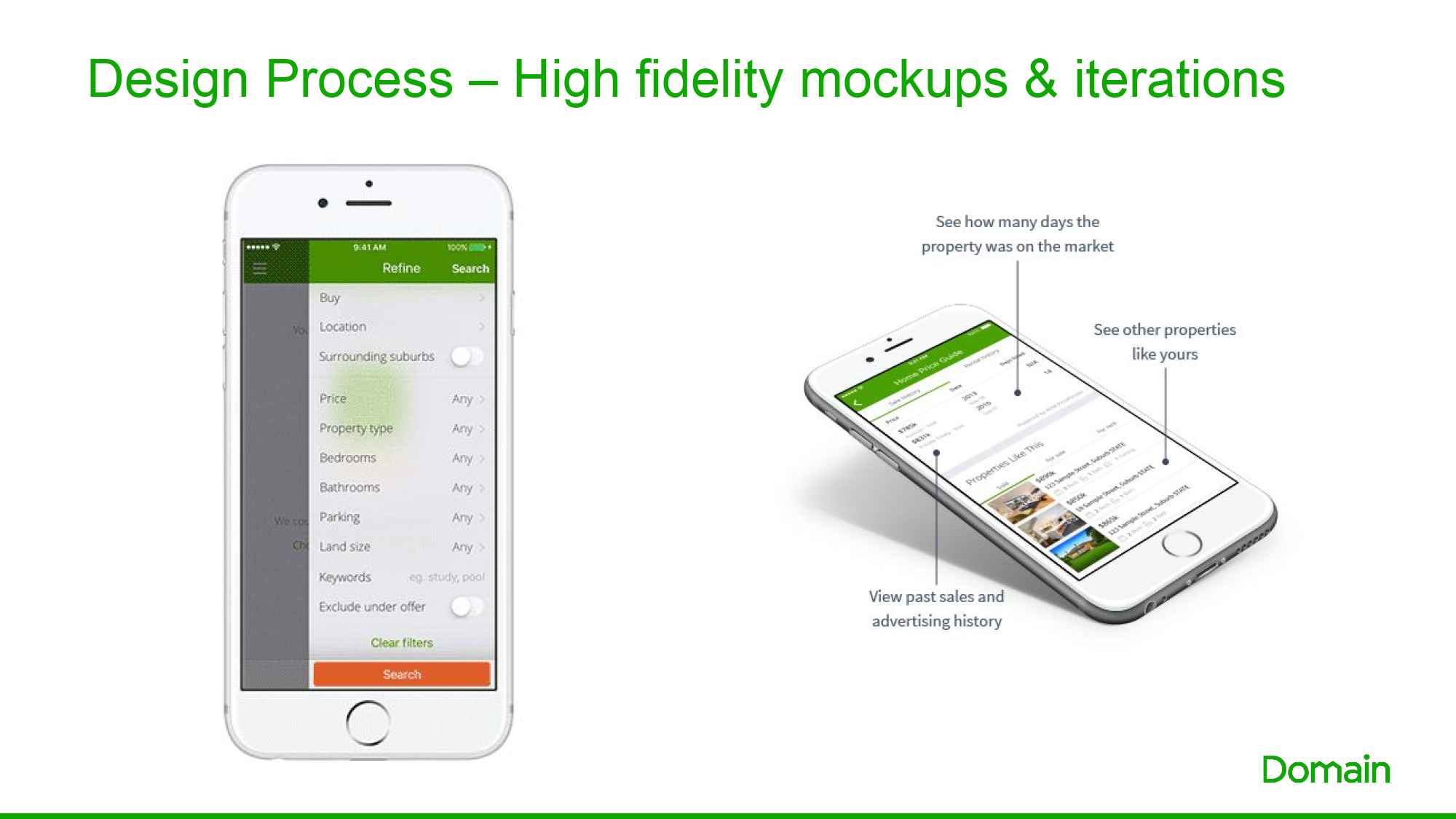
We continue to develop our designs led by stakeholder feedback, business objectives and product/UX input
During this, we also went through the Domain rebrand which led to further development ensuring the updated brand flowed through, as well as the Social icons in footer being updated
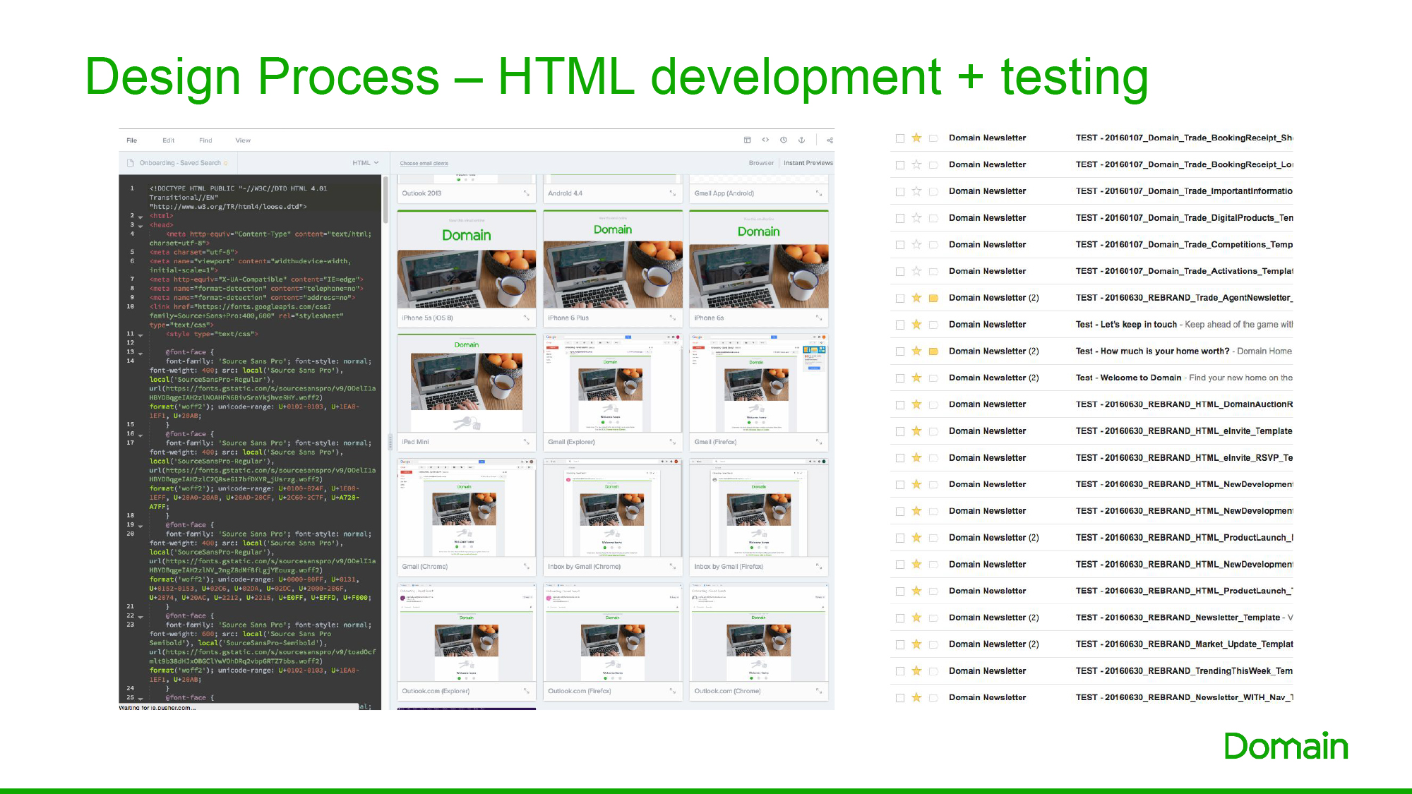
So, now for the really fun part – coding and testing in over 20 email clients and devices.
All email clients on desktop and mobile render an email differently, some don’t render a design elements at all.
We need to perform rigorous testing in Litmus (and find secret enjoyment in spamming each other’s inbox) to ensure that our emails look great across all devices.
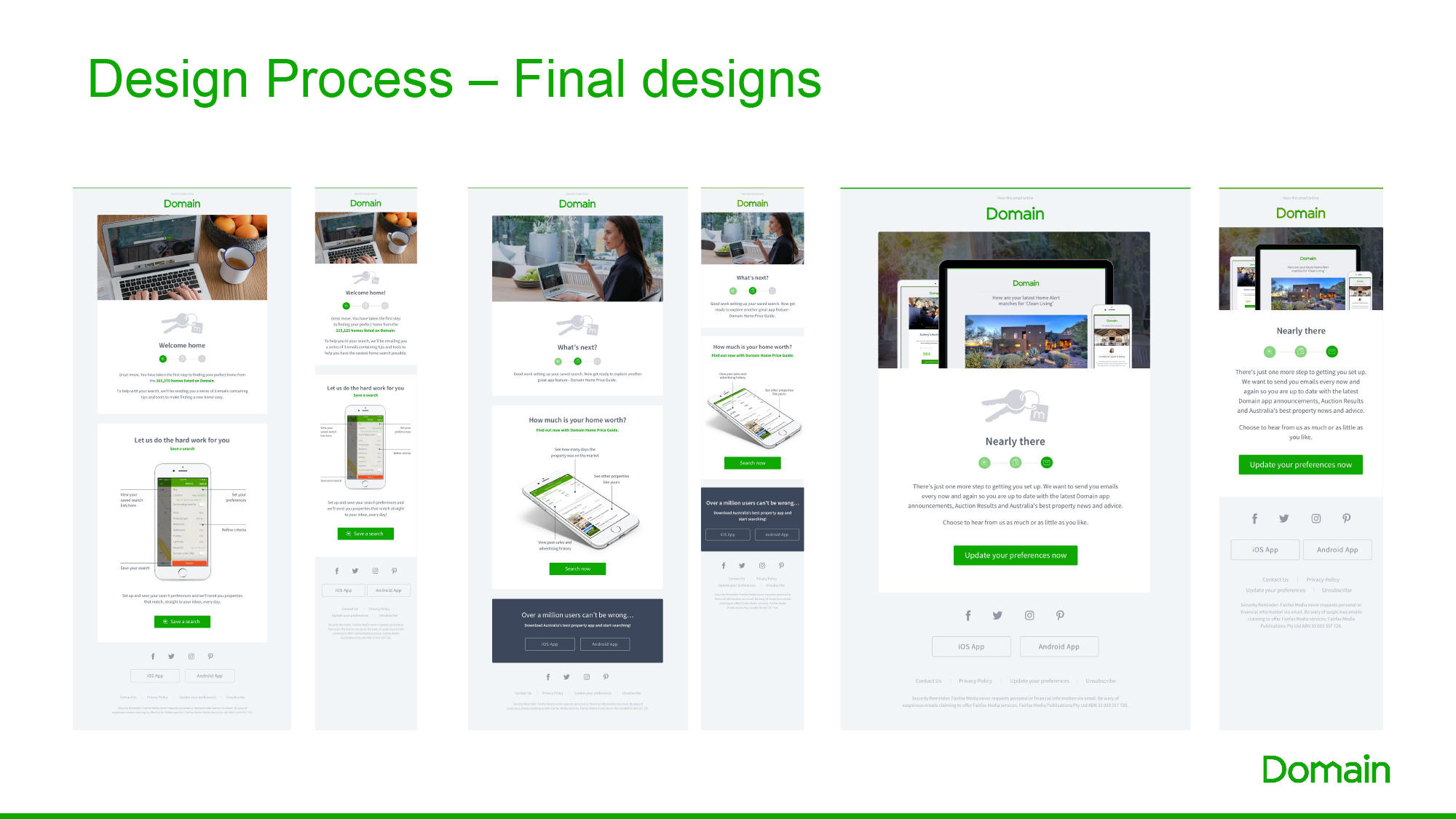
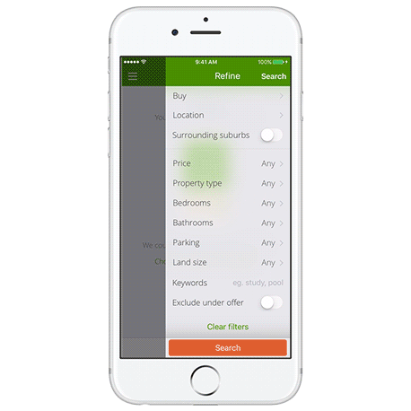
And here are the final designs both desktop and mobile executions
And it doesn’t end there. We will continue to develop, improve and optimise these designs based on user reviews, changes in the business and digital capabilities.
We’re really proud with the result, thrilled that we have met business objective and are looking forward to seeing open rates and reporting on how it’s being received by our target market.